Future supply is a key metric for the voluntary carbon market (VCM) as it holds relevance for future pricing determination. We are happy to announce the work we are undertaking towards the development of a predictive supply model for the VCM.
The model aims to estimate the long term future supply of credits, using price for credits as a key driver for project origination and credit issuance. The model is differentiated across the main project sectors of the VCM, and it is based on historical pricing data, as well as inputs from experts in the market.
As we continue to refine the model with more detailed assumptions, we’d love to get further market inputs on some of the core assumptions we are using from project developers and other experts.
Specifically, we are interested in soliciting feedback on assumptions around:
- Elasticity of credit supply
- Maximum prices per ton
- Project development time
If you are interested in getting in touch, please download this spreadsheet where we detail more on the inputs that we are interested in receiving.
Our end goal for the model is to determine the price of credits by overlaying supply scenarios with demand scenarios. The VCM demand forecasts that we published a couple of months ago in our Premium Dashboard platform will be used to map future demand curves.
Why have we developed the model?
Several claims have been made in the past months about how VCM supply will grow in future years, predicting the VCM to grow to somewhere between $10b to $250b by 2030. However, such rosy projections are overly simplified and are not grounded in data that reflects the current state of the market.
A full explanation of the model methodology can be found here.
We believe carbon price will be the key determinant in defining how and where supply will be generated, which is why we made it the principal input for our model. Specifically, by carbon price we mean the price paid per carbon credit for the duration of a project in real $. While price is treated as the main explanatory variable, our position in the market allows us to shape sector-level curves and to adjust and sense-check the model’s outputs.
Additionally, we believe that our long term supply model will allow market participants to:
- Determine individual sectors’ supply contributions to total market supply, and consequently, future project types’ premiums and discounts,
- Understand Internal Rate of Returns (IRR) for the various sectors and at aggregate level, to help guide present investment decisions, and
- Estimate future market surplus and shortage, derived from the overlay with demand curves.
What is the logic of the model?
The model’s outcome represents our forecast of how market supply will shape in response to a price change. The model does not yet take into account price changes over time, but it allows to define how supply will be impacted by a price change happening today (or on the date of the model run). The model is developed over 4 main steps:
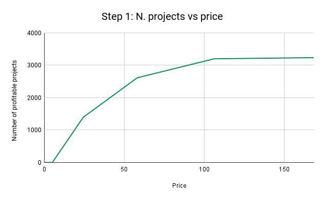
1. How many projects are profitable at each price?
The model calculates the number of projects that would be profitable to set up in a given year at a given price. For any price on the x-axis, the model uses a combination of simple linear and exponential functions to determine a number of projects (on the y-axis) that would be profitable to set up. As expected, supply increases as price raises. but the rate of increase changes over different price intervals. The main assumption behind this declining rate of increase is the idea that price increases become progressively less impactful on the profitability of projects. A price change between 0 and $50 will determine a larger change in the number of profitable projects than a price change between 100 and $150.
The figure below shows a sample of how a projects-vs-price curve will look like.
.png?width=816&height=503&name=Step%201_%20N.%20projects%20vs%20price%20(2).png)
2. How long does it take for projects to be created and to issue credits?
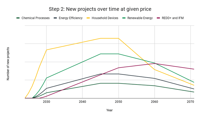
The second step aims at mapping how projects are actually created over time. The first aspect we look at is the time lag between a price change and a project getting approved, which can span several years. Secondly, we consider that not all projects take the same time to start issuing credits, so we estimate percentages of projects that start issuing across a 4-year time period, to simulate a phase in. Thirdly, we acknowledge that projects’ crediting periods have a limited time frame, so that the “net” number of projects in the market will not increase infinitely, as some periodically reach the end of their crediting period.
The figure below shows how new profitable projects would be set up over time at a given price for a sample of sectors.

3. What is the starting point?
As we aim to map out future supply, we take into account the number of projects that are currently active in the market and add the profitability curves on top of those. In this step, we also account for pending projects, meaning those projects that would get created no matter what the price is, as they are already in developers’ pipeline. This means that our model will not show a projects’ curve starting from 0 as final output, as the number of projects currently existing in the market is taken as a bottom line.
The graph below shows how new projects will populate a sample of market’s sectors at a given price considering pre-existing projects.
.png?width=854&height=528&name=Step%203_%20Cumulative%20n.%20projects%20considering%20starting%20point%20(1).png)
4. From projects to issuances
In the final step of the model, we map out the actual supply volumes (credits issuances) that correspond to the project numbers that we estimated. We do this by looking at the historical trends of issuances per project, and by reviewing the average estimated annual emission reductions reported by existing projects. We then transition from project numbers to credits volumes by multiplication. Therefore, the curve we obtain for credits-vs-price is similar in shape to the projects-vs-price one.
The chart below shows how the cumulative credits supply could look like for a sample of market sectors for a specific year in time. Cumulative issuances vs price curves would slightly vary depending on the year they represent.

Sum-up: Long-term market supply from market price
As explained through this section, the model allows to derive cumulative market supply curves for any inputted price. The figures presented allow one to get a sense of the possible outputs that can be derived from the model, although broader and more specific insights can be drawn. We are currently running the model for 15 different sectors, covering the broad VCM project types and some more specific baskets (e.g., Agriculture, Waste Disposal, Direct Air Capture and Ocean-based CDR). Geography-specific sectors will be added as well (e.g. forestry projects in Amazonian countries), as we acknowledge that projects-vs-pricing trajectories can diverge among different countries.
What’s next?
We're advancing in two key areas: firstly, integrating the model with research on project costs to estimate required capital investments and potential investor returns. Secondly, we're overlaying the outputs of our supply model with forecasted demand curves. We welcome any feedback or questions regarding the model's value and logic.
