In this blog, we visualise credit retirement flows using Sankey charts and look at some of the key patterns that emerge out of the flows.
As the voluntary carbon market expands in popularity, there is an urgent need for more and better data on the projects that issue credits and how the credits are used after issuance. This can aid transparency in the market and help examine offsetting claims. To create this post, we use information from tens of thousands of projects which are included in our overview of the market. More specifically, we focus on country-to-country and continent-to-continent flows of credits between buyers and projects. We create this analysis using Sankey charts, which are now available to users of our platform.
What exactly is a Sankey Diagram?
Sankey diagrams are a type of flow diagram in which the connection width varies with the flow rate. These graphs highlight the major transfers or flows that occur inside a system. They aid in locating the most significant contributions to a flow and frequently depict conserved quantities within clearly defined system boundaries.
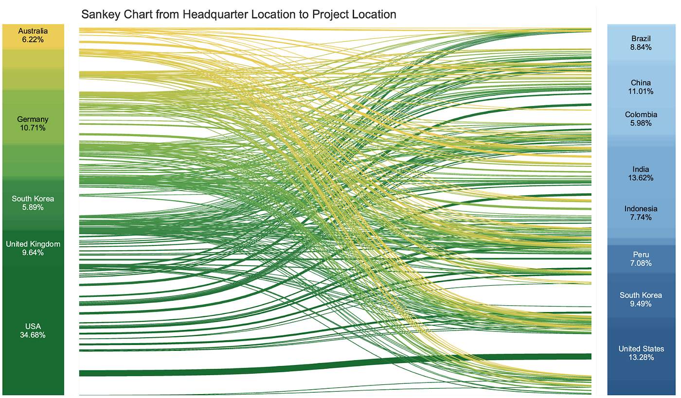
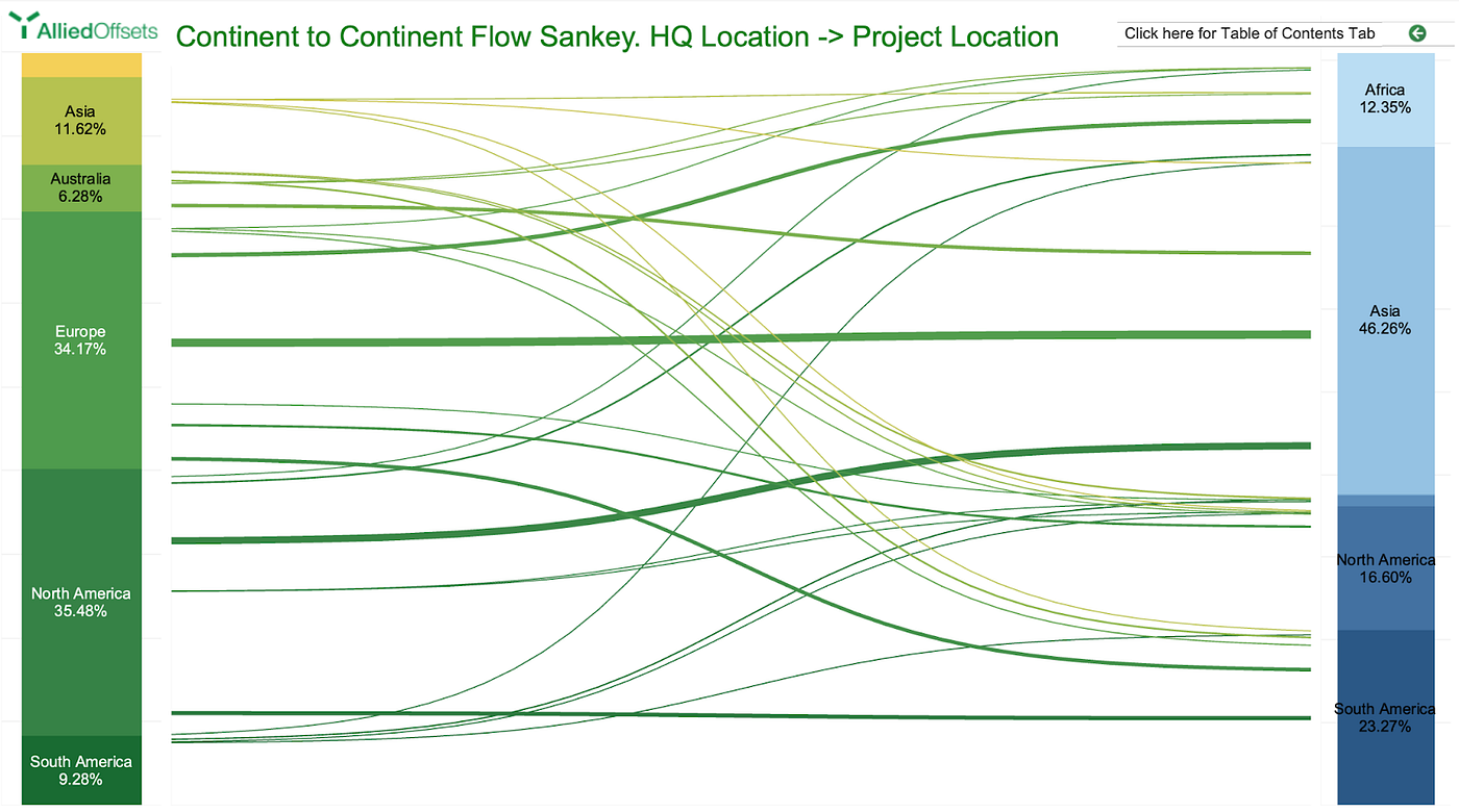
In this case, we are showing global credit flows and determine whether companies tend to offset with credits from projects that are geographically close or far. The data comes from the companies that we have matched to transactions over the previous several months, meaning the charts below showcase about 20% of the total retirements in the market.

Observations
The country that has the most brands offsetting their emissions is the USA, followed by the United Kingdom, Germany, and Australia.
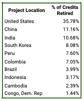
Of the projects that US companies offset with, more than a third come from the US as well. Chinese and Indian projects round out the top three.

On a continental scale, corporations based in Europe and North America retire the most credits using offsets from projects based in Asia.

For more information on flow data among buyers and projects in the VCM, please reach out to hello@alliedoffsets.com. You can also view a demo of our dashboard here.
